
If you’re someone who’s interested in maps, you may have come across a type of map known as a dot density map. While this type of map may seem straightforward, it’s important to understand the basics of how it works and what it’s used for. In this article, we’ll take a closer look at what is a dot density map and how it’s used in cartography and data visualization.
What is a Dot Density Map In GIS?
A dot density map is a type of thematic map that uses dots to represent the density of a particular phenomenon or variable across a geographic area. In a dot density map, each dot represents a certain number of occurrences of the phenomenon being mapped.
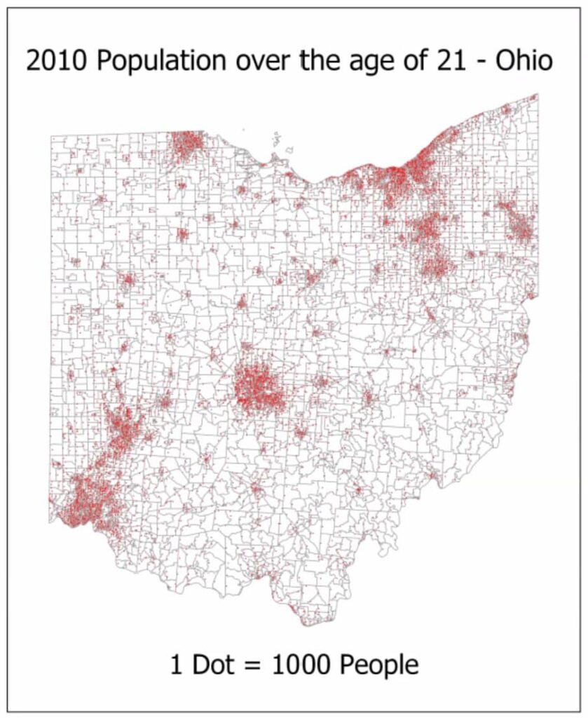
For example, in a dot density map of population, each dot represent 1000 people.
How are Dot Density Maps Created?
To create a dot density map (Dot Distribution Map), you need to have data that is related to a geographic area. This could be anything from population density to crime rates to environmental factors. Once you have your data, you need to choose a geographic unit to represent on the map, such as a county, state, or country.
Next, you need to decide how many dots to use to represent each unit of data. For example, if you are mapping population density, you might decide to use one dot to represent every 1,000 people. Then, you need to distribute the dots within each geographic unit in a way that accurately reflects the data.
Finally, you can create a map that shows the distribution and density of the data using the dots. The map can be color-coded or labeled to make it easier to read and interpret.
When are Dot Density Maps Used?
Dot density maps are useful for mapping phenomena that are discrete and well-defined, such as population, housing density, or crime rates. They are particularly useful for visualizing the distribution of these phenomena across a geographic area, as they can provide a quick and easy way to see where concentrations of the phenomenon are located.
Additionally, dot density maps are a great way to compare data between different geographic units. For example, you can use a dot density map to compare population density between different states or countries.
History of Dot Density Map (Dot Distribution Map)
One of the most famous examples of dot density mapping is the map of the 1854 cholera outbreak in London created by Dr. John Snow. Dr. Snow was a British physician who was able to identify the source of the outbreak and track the spread of the disease using a dot density map.
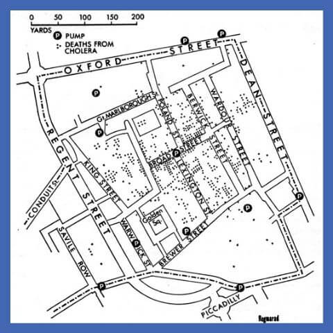
At the time of the outbreak, cholera was a highly contagious disease that was responsible for many deaths.
Dr. Snow suspected that contaminated water was the source of the outbreak and began collecting data on the location of cholera cases and the water supply in the affected areas. He used this data to create a dot density map that showed the number and location of cholera cases in the affected areas.
Today, dot density maps are still widely used in epidemiology and public health to track the spread of diseases and identify potential sources of outbreaks. Dr. Snow’s pioneering work with the dot density map continues to inspire public health researchers and practitioners around the world.
Advantages of Dot Density Maps
One of the main advantages of dot density maps is that they can provide a clear and easy-to-understand visual representation of data. Some of the advantages of Dot Density Maps are:
1. Clear and concise representation of data
Dot density maps provide a clear and concise representation of data by using a simple and easy-to-understand visual format. This can help users quickly understand the spatial distribution of a phenomenon.
2. Ability to show density variations
Dot density maps can show density variations within a geographic area, making them useful for displaying variations in population density or other types of density-related data.
3. Effective tool for comparing phenomena
Dot density maps can be used to effectively compare the density of different phenomena, allowing users to quickly identify areas where one phenomenon is more prevalent than another.
4. Easily customizable and flexible
Dot density maps can be easily customized and adapted to suit specific data needs. They can be created in a variety of software programs and can be tailored to display different types of data, making them a flexible and versatile tool for data visualization.
Limitations of Dot Density Maps
While dot density maps can be useful, they also have some limitations. One of the main limitations is that they can be difficult to read if the density of dots is too high or if the dots are too small. Here are some disadvantages of Dot Density Maps:
1. Can be difficult to accurately count dots
Counting dots can be a tedious and time-consuming task, particularly when dealing with large datasets or complex phenomena. This can make it difficult to accurately represent the data in a dot density map.
2. Limited use for continuous data
Dot density maps are best suited for representing discrete phenomena, making them less useful for continuous data or data that varies over a continuous range.
3. Can be affected by dot size and distribution
The size and distribution of dots can impact the overall appearance of a dot density map and can affect how users interpret the data being presented. Careful consideration must be given to dot size and distribution to ensure that the map accurately represents the underlying data.
4. May oversimplify complex phenomena
Dot density maps provide a simplified representation of complex phenomena, which can lead to oversimplification or the loss of important nuances in the data. This can limit the usefulness of dot density maps for certain types of data analysis.
5. May not be suitable for all types of spatial data
Dot density maps are best suited for data that can be easily counted or that occur in well-defined locations. They may not be suitable for more complex types of spatial data, such as data that is clustered or unevenly distributed.
6. Limited ability to convey absolute values
While dot density maps can effectively show the relative density of different phenomena, they may not be as effective at conveying absolute values. This can limit their usefulness for certain types of data analysis where exact values are important.
Types of Dot Maps
One-to-one and one-to-many dot maps are two types of dot maps that are useful in different contexts. They both use dots to represent data, but their approach is different.
One-To-One Dot Maps
In a one-to-one dot map, each dot on the map represents a single occurrence or event. These types of maps are useful when dealing with data that is discrete and individual, such as the location of a particular type of tree in a forest or the location of individual crimes in a city. One-to-one dot maps are often used in forensic analysis or in tracking the spread of diseases.
One-To-Many Dot Maps
In a one-to-many dot map, each dot on the map represents a quantity of occurrences or events. These types of maps are useful when dealing with data that is continuous or variable, such as the number of votes in a particular precinct or the number of accidents in a given city block. One-to-many dot maps are often used in demographic analysis or in visualizing the distribution of resources.
Examples of Dot Density Maps
Dot density maps can be used to represent a wide range of phenomena. Some examples of dot density maps include:
- Population density maps
- Crime rate maps
- Housing density maps
- Election results maps
- Disease incidence maps
How To Create a Dot Density Map
To create a dot density map, you can use a variety of software programs or online tools. Some popular options include:
- ArcGIS
- QGIS
- Tableau
- Mapbox
Each of these tools has its own strengths and weaknesses, so it’s important to choose the one that best fits your needs and experience level.
Tips for Creating Effective Dot Density Maps
If you’re interested in creating a dot density map, there are several tips that can help you create an effective and informative map. These include:
- Choosing an appropriate geographic area and phenomenon to map.
- Collecting accurate and relevant data.
- Using an appropriate number of dots to represent each occurrence of the phenomenon.
- Ensuring that the dots are evenly distributed across the map.
- Using a clear and easy-to-read legend to explain the map.
Conclusion
In conclusion, dot density maps are a useful and versatile tool for cartographers and data visualization experts. By using dots to represent the density of a particular phenomenon across a geographic area, dot density maps can provide a quick and easy way to see where concentrations of the phenomenon are located. However, it’s important to ensure that the data is properly collected and that the appropriate number of dots is used to represent each occurrence of the phenomenon.
FAQs: What is a Dot Density Map?
What is the difference between a dot density map and a choropleth map?
A choropleth map uses color to represent the density of a phenomenon, while a dot density map uses dots.
Can dot density maps be used to represent continuous data?
No, dot density maps are best suited for representing discrete and well-defined phenomena.
Are dot density maps suitable for representing data at different scales?
Dot density maps can be used to represent data at different scales, but it’s important to ensure that the appropriate number of dots is used to represent each occurrence of the phenomenon.
What is shown on a dot map?
A dot map is a type of map that uses dots to represent the spatial distribution of a variable. Each dot on the map represents a certain quantity of the variable being mapped, such as population or the number of occurrences of a particular event. By aggregating these dots, patterns and trends in the data can be visualized and analyzed.
What is a dot density map limitations?
One limitation of dot density maps is that they can be difficult to interpret accurately when the dots are too close together or too small, making it hard to distinguish individual dots.
What is meant by DOT method?
DOT method refers to a technique for displaying and analyzing point data. This method involves representing each point with a small dot or symbol on a map, with the size and color of the dot indicating attributes or characteristics of the point data.